🖼️ Images in CSS — Complete Guide
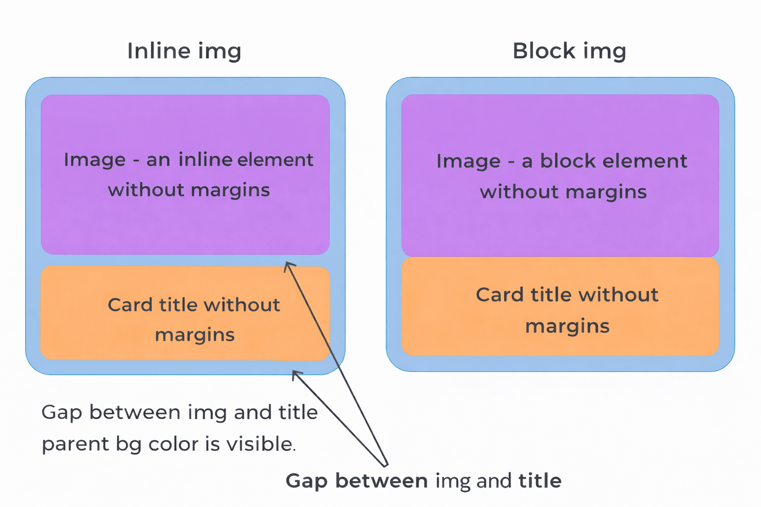
1. 📌 Images are inline elements
By default, the <img> tag is an inline element.
👉 This means:
- it has horizontal spacing (like text)
- it has a bottom gap (baseline space)
❗ Problem:
- this bottom gap looks like an unwanted empty space
- it breaks layouts
- it is almost never needed
2. ✅ How to remove the bottom gap
👉 Solution — make the image a block element:
img {
  display: block;
}
✔ Result:
- bottom gap disappears
- layout becomes stable
- this is standard practice
3. 📐 Responsive (“fluid”) images
❗ Problem:
- without CSS, images keep their original size
- they can overflow their container
✅ Solution:
img {
  display: block;
  max-width: 100%;
}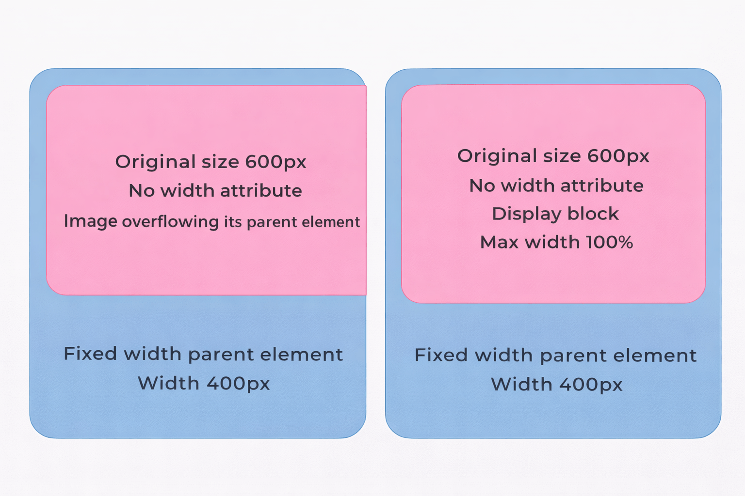
✔ What this does:
- image shrinks to fit the container
- never becomes larger than original size
- keeps quality
👉 This is called: responsive images
❗ Difference: max-width vs width
🟦 width: 100%
- Always forces the element to be exactly 100% of the parent
- Even if the content is smaller → it stretches
- Can break layout or look weird
👉 Example:
- Image is 200px
- Parent is 400px
- ➡️ Image becomes 400px (stretched)
🟩 max-width: 100%
- Sets a maximum limit, not a fixed size
- Element can be smaller, but never bigger than parent
- Keeps original size if smaller
👉 Example:
- Image is 200px
- Parent is 400px
- ➡️ Image stays 200px (no stretch)
👉 If image is 800px:
- ➡️ It shrinks to 400px (fits safely)
4. 🧠 object-fit — controlling image inside a container
❗ Problem:
- container has one size
- image has different proportions
✅ Property:
object-fit: value;🔑 Main values
1. fill (default)
- stretches image
- ❌ distorts it
2. contain
- keeps proportions
- shows full image
- ❌ leaves empty space
3. ✅ cover (most important)
- keeps proportions
- fills container
- crops excess parts
👉 cover is most commonly used
4. none
- original size
- ignores container
5. scale-down
- picks smaller of
noneorcontain
5. 📦 Proper usage of object-fit
✔ HTML:
<div class="thumb">
  <img src="image.jpg" alt="">
</div>
✔ CSS:
.thumb {
  width: 300px;
  height: 400px;
}

.thumb img {
  width: 100%;
  height: 100%;
  object-fit: cover;
}
✔ Result:
- all images same size
- no distortion
- looks like e-commerce cards
6. 🌍 Global styles (best practice)
👉 In real projects always use:
img {
  display: block;
  max-width: 100%;
}
✔ Why:
- no repeated code
- no layout bugs
- all images responsive
7. 🧩 Common mistakes
- ❌ Forget
display: block→ bottom gap appears - ❌ Use
width: 100%→ image stretches and loses quality - ❌ No container height →
object-fitwon’t work - ❌ No
height: 100%on img → image doesn’t fill container
8. 🧠 Quick summary
👉 Always:
img {
  display: block;
  max-width: 100%;
}
👉 For cards:
img {
  width: 100%;
  height: 100%;
  object-fit: cover;
}
🔥 Real-world usage
Used in:
- e-commerce websites 🛒
- blogs 📰
- galleries 🖼️
- product cards 📦
🚀 Want next step?
I can give you:
- ✅ real junior frontend tasks
- ✅ interview-style questions
- ✅ mini project (product cards layout)