📦 Container Properties (Flexbox)
🔹 Introduction
Having a powerful helicopter is not enough — you also need to know how to control it.
The same applies to Flexbox.
To use Flexbox effectively, you must:
- understand what a flex container is
- know how to turn elements into flex items
- control spacing between elements
You also need to learn how to solve common tasks from:
- 🎨 designers
- 👤 clients
For example:
- change the direction of elements
- control how elements are aligned inside a container
- handle real-world layout cases
🔹 Flex Container
A flex container is a parent element that:
👉 controls the layout of its children
🧠 Key idea
👉 The container defines how elements behave inside it
What container properties control
✔ 1. Axis direction
- main axis (row / column)
- cross axis (perpendicular)
✔ 2. Wrapping (multi-line layout)
- whether elements stay in one line
- or move to multiple rows
✔ 3. Positioning of elements
- alignment along main axis
- alignment along cross axis
🔥 Short version
- flex container = parent
- controls:
- direction
- wrapping
- alignment
📦 display Property (Flexbox)
🔹 Definition
The display property creates a flex container.
display: flex | inline-flex;🔹 Values
➤ display: flex
- creates a block-level flex container
- behaves like a block element
- takes full width
➤ display: inline-flex
- creates an inline-level flex container
- behaves like an inline-block element
- width depends on content
🔹 Key behavior
👉 When applied:
- the element becomes a flex container
- its direct children become flex items
❗ Important
- Only direct children are affected
- NOT deeper nested elements (descendants)
🔹 Example (HTML)
<ul class="menu">
  <li class="item"><a href="" class="link">Home</a></li>
  <li class="item"><a href="" class="link">Blog</a></li>
  <li class="item"><a href="" class="link">Podcasts</a></li>
  <li class="item"><a href="" class="link">Contacts</a></li>
</ul>
🔹 Example (CSS)
* {
  box-sizing: border-box;
}

body {
  font-family: sans-serif;
  background-color: #f9f9fd;
}

.menu {
  padding: 10px;
  margin: 0;
  list-style: none;
  border-radius: 4px;
  background-color: #2196f3;
  box-shadow: 0px 2px 1px -1px rgba(0, 0, 0, 0.2),
    0px 1px 1px 0px rgba(0, 0, 0, 0.14), 0px 1px 3px 0px rgba(0, 0, 0, 0.12);

  /*  Making ul.menu a Flex container  */
  display: flex;
}

.menu .link {
  display: block;
  padding: 10px;
  border-radius: 4px;
  text-decoration: none;
  color: black;
  background-color: #fff;
}

.menu .link:hover {
  text-decoration: underline;
}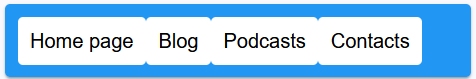
🔹 Result
.menu→ becomes flex container.item→ become flex items- items are arranged along main axis
🧭 Default direction
flex-direction: row- main axis → left → right
🔥 Short summary
display: flex
- creates flex container
- children → flex items
- layout → horizontal (by default)
display: inline-flex
- same as flex
- but behaves like inline element
🧠 Important rule
👉 Flexbox affects only direct children
📦 Flexbox + gap
✅ HTML
<ul class="menu">
  <li class="item"><a href="#" class="link">Home page</a></li>
  <li class="item"><a href="#" class="link">Blog</a></li>
  <li class="item"><a href="#" class="link">Podcasts</a></li>
  <li class="item"><a href="#" class="link">Contacts</a></li>
</ul>
✅ CSS
* {
  box-sizing: border-box;
}

body {
  font-family: sans-serif;
  background-color: #f9f9fd;
}

/* FLEX CONTAINER */
.menu {
  display: flex;
  gap: 8px; /* spacing between items */

  padding: 10px;
  margin: 0;
  list-style: none;
  border-radius: 4px;
  background-color: #2196f3;

  box-shadow: 0px 2px 1px -1px rgba(0, 0, 0, 0.2),
              0px 1px 1px 0px rgba(0, 0, 0, 0.14),
              0px 1px 3px 0px rgba(0, 0, 0, 0.12);
}

/* LINKS */
.menu .link {
  display: block;
  padding: 10px;
  border-radius: 4px;
  text-decoration: none;
  color: black;
  background-color: #fff;
}

.menu .link:hover {
  text-decoration: underline;
}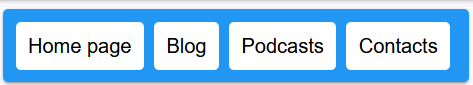
🔹 What gap does
👉 gap: 8px;
- adds space between flex items
- works only on container
- replaces margins between items
🔥 Important
❗ Instead of this old way:
.item {
  margin-right: 8px;
}
👉 Use this:
.menu {
  gap: 8px;
}- cleaner
- no extra margins
- no last-item problems
🧠 Result
- items are in one horizontal row
- spacing between them = 8px
- no need for margins
📦 flex-direction Property (Flexbox)
🔹 Definition
The flex-direction property defines:
👉 the direction of the main axis
👉 and how flex items are arranged inside the container
🔹 Syntax
flex-direction: row | row-reverse | column | column-reverse;🔹 Values Explained
➤ row (default)
👉 Main axis: left → right
- items go horizontally
- normal order
Home → Blog → Podcasts → Contacts➤ row-reverse
👉 Main axis: right → left
- items are reversed
- order is flipped
Contacts ← Podcasts ← Blog ← Home➤ column
👉 Main axis: top → bottom
- vertical layout
- like a list
Home
Blog
Podcasts
Contacts
➤ column-reverse
👉 Main axis: bottom → top
- vertical reversed
Contacts
Podcasts
Blog
Home
🔥 Important concept
👉 flex-direction does NOT just move items
❗ It changes the direction of the main axis
🧠 This means
main-startandmain-endare swapped- items always go: main-start → main-end
📄 Example (HTML)
<ul class="menu">
  <li class="item"><a href="#" class="link">Home page</a></li>
  <li class="item"><a href="#" class="link">Blog</a></li>
  <li class="item"><a href="#" class="link">Podcasts</a></li>
  <li class="item"><a href="#" class="link">Contacts</a></li>
</ul>

<ul class="menu reversed">
  <li class="item"><a href="#" class="link">Home page</a></li>
  <li class="item"><a href="#" class="link">Blog</a></li>
  <li class="item"><a href="#" class="link">Podcasts</a></li>
  <li class="item"><a href="#" class="link">Contacts</a></li>
</ul>
🎨 Example (CSS)
.menu {
  display: flex;
  gap: 8px;

  padding: 15px;
  margin: 0;
  list-style: none;
  border-radius: 4px;
  background-color: #2196f3;
}

/* Reverse direction */
.menu.reversed {
  flex-direction: row-reverse;
  margin-top: 20px;
}

.menu .link {
  display: block;
  padding: 10px;
  border-radius: 4px;
  text-decoration: none;
  background-color: white;
  color: black;
}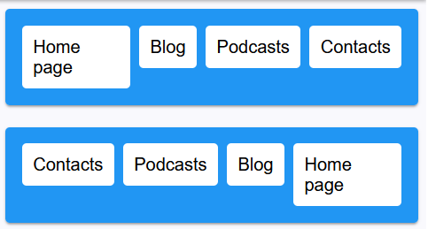
🧠 What happens visually
First menu (row default):
Home | Blog | Podcasts | ContactsSecond menu (row-reverse):
Contacts | Podcasts | Blog | Home❗ Very important
👉 Items are NOT just pushed to the right
✔ The order is reversed
🔥 Summary
flex-direction controls:
- direction of layout
- position of main axis
- order of items
Default:
flex-direction: row;Key rule:
main-start → main-end📦 justify-content
The property justify-content controls how flex items are positioned along the main axis (from main-start to main-end).
🔹 Syntax
justify-content: flex-start | flex-end | center | space-between | space-around | space-evenly;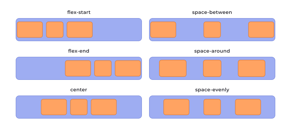
🔹 Values
flex-start
Items are placed at the beginning of the axis (default).
Example: items stick to the left (in row).
flex-end
Items are placed at the end of the axis.
Example: items stick to the right.
center
Items are centered along the axis.
Equal space on both sides.
space-between
Items are spread out evenly.
- First item → start
- Last item → end
- Space only BETWEEN items
space-around
Items have space around them.
- Space on edges is smaller (half)
- Space between items is bigger
space-evenly
Items are distributed evenly.
- Equal space between items
- Equal space at edges
❗ Important
justify-content works only on the MAIN AXIS.
🔹 Depends on flex-direction
If flex-direction: row
→ main axis is horizontal (left ↔ right)
If flex-direction: column
→ main axis is vertical (top ↕ bottom)
📄 Example
.menu {
  display: flex;
  justify-content: center;
}
🧠 Key idea
justify-content = control position along MAIN AXIS
⚠️ Common mistake
This property does NOT always center horizontally or vertically.
It depends on flex-direction.
🔹 Simple rule
row → controls LEFT / RIGHT
column → controls TOP / BOTTOM
🔥 Summary
- works only in flex container
- controls spacing between items
- aligns items along main axis
📦 align-items
The property align-items controls how flex items are positioned along the cross axis.
It is similar to justify-content, but works on the cross axis, not the main axis.
🔹 Syntax
align-items: stretch | flex-start | flex-end | center | baseline;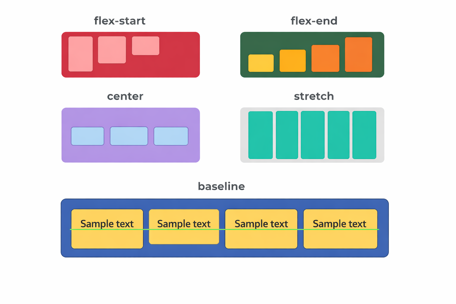
🔹 Values
stretch (default)
Items stretch to fill the container along the cross axis.
Height (or width in column) expands automatically.
flex-start
Items are aligned to the start of the cross axis.
Example: top (in row direction).
flex-end
Items are aligned to the end of the cross axis.
Example: bottom (in row direction).
center
Items are centered along the cross axis.
baseline
Items are aligned based on the text baseline.
Useful when elements have different font sizes.
❗ Important
align-items works on the CROSS AXIS.
🔹 Depends on flex-direction
If flex-direction: row
→ cross axis is vertical (top ↕ bottom)
If flex-direction: column
→ cross axis is horizontal (left ↔ right)
📄 Example
.menu {
  display: flex;
  align-items: center;
}
🧠 Key idea
align-items = control position along CROSS AXIS
⚠️ Common mistake
People confuse it with justify-content.
justify-content → main axis
align-items → cross axis
🔹 Simple rule
row → align-items controls TOP / BOTTOM
column → align-items controls LEFT / RIGHT
🔥 Summary
- works only in flex container
- aligns items across cross axis
- often used with
justify-content
📦 flex-wrap
The property flex-wrap controls whether flex items stay in a single line or can move to multiple lines when there is not enough space.
🔹 Default behavior
When you use:
display: flex;👉 the container is single-line by default
👉 all items stay in one row
👉 items may shrink to fit the container
🔹 Syntax
flex-wrap: nowrap | wrap | wrap-reverse;🔹 Values
nowrap (default)
All items stay in one line (no wrapping).
✔ Items shrink if needed
❌ Items do NOT move to next line
Example:
[1][2][3][4][5] → squeezed into one rowwrap
Items move to a new line when there is no space.
✔ Multiple rows are created
✔ Lines go from top → bottom (cross axis direction)
Example:
[1][2][3]
[4][5]
wrap-reverse
Same as wrap, but lines go in reverse direction.
✔ New rows appear bottom → top
Example:
[4][5]
[1][2][3]
❗ Important
flex-wrap works on the cross axis direction.
🔹 Depends on flex-direction
If:
flex-direction: row;(main axis = horizontal)
👉 wrapping creates new rows vertically
Example:
[1][2][3]
[4][5][6]
If:
flex-direction: column;(main axis = vertical)
👉 wrapping creates new columns horizontally
Example:
[1] [4]
[2] [5]
[3] [6]
📄 Example
.menu {
  display: flex;
  flex-wrap: wrap;
}
🧠 Key idea
flex-wrap = control how items break into multiple lines
⚠️ Common mistakes
❌ Expecting items to go to next line automatically
→ they will shrink instead if flex-wrap is not set
❌ Confusing wrapping direction
→ wrapping follows the cross axis, not main axis
🔹 When to use
- responsive layouts
- grids with unknown number of items
- menus that must not overflow
🔥 Summary
nowrap→ single line (default)wrap→ multiple lines (normal direction)wrap-reverse→ multiple lines (reverse direction)- works with
flex-direction - controls layout when space is limited
📦 Grid (Card Layout)
Flexbox can create a grid of elements (cards, products, gallery, blog posts).
This works by combining:
flex-wrap(multi-line layout)gap(spacing)- calculated width (for equal columns)
🔹 Step 1 – Enable Flexbox + wrapping
.card-set {
  display: flex;
  flex-wrap: wrap;
}
✔ display: flex → activates flexbox
✔ flex-wrap: wrap → allows items to move to next line
Without flex-wrap:
❌ all items stay in one row and shrink
🔹 Step 2 – Add spacing
.card-set {
  display: flex;
  flex-wrap: wrap;
  gap: 10px;
}
✔ gap creates space:
- between columns
- between rows
❗ Important
gap = row-gap + column-gap
If needed:
row-gap: 10px;
column-gap: 20px;
🔹 Step 3 – Set item width
Flexbox does NOT create columns automatically
👉 You must define width manually
📐 General Formula
width = (100% - total_gap_width) / number_of_items🔍 How to calculate correctly
Example:
You want 3 items per row
- number of items = 3
- number of gaps = 2
- gap = 10px
👉 total gap = 2 × 10px = 20px
✅ Final code
.item {
  width: calc((100% - 20px) / 3);
}
🔹 Why this works
100% → full container width
20px → space taken by gaps
remaining space → divided between items
🔹 Visual Result
[ item ][ item ][ item ]
[ item ][ item ][ item ]
Equal width + equal spacing
🔹 Important Rules
Rule 1:
Number of gaps = number of items - 1
Example:
3 items → 2 gaps
4 items → 3 gaps
Rule 2:
Gap MUST be subtracted in calc()
❌ Wrong:
width: 33.33%;→ causes overflow
Rule 3:
Use percentages, NOT fixed width
❌ Bad:
width: 300px;✔ Good:
width: calc((100% - 20px) / 3);🔹 Common Mistakes
❌ Forgetting flex-wrap
→ items stay in one row
❌ Not subtracting gap
→ layout breaks
❌ Using px instead of %
→ not responsive
📄 Example HTML
<section class="section">
  <div class="container">
    <ul class="card-set">
      <li class="item">
        <h2>Lorem ipsum dolor</h2>
        <p>Lorem ipsum dolor sit amet consectetur adipisicing elit.</p>
      </li>
      <li class="item">
        <h2>Lorem ipsum dolor</h2>
        <p>Lorem ipsum dolor sit amet consectetur adipisicing elit.</p>
      </li>
      <li class="item">
        <h2>Lorem ipsum dolor</h2>
        <p>Lorem ipsum dolor sit amet consectetur adipisicing elit.</p>
      </li>
    </ul>
  </div>
</section>
🧠 Key Idea (VERY IMPORTANT)
Flexbox grid =
flex-wrapgap- calculated width
🔹 When to use
- product cards
- blog previews
- image galleries
- responsive layouts
🚀 Next step (important)
To make it responsive, you can change number of columns:
- 3 columns → desktop
- 2 columns → tablet
- 1 column → mobile
👉 I can show you that next