ELEMENT BACKGROUND
A person needs less than a second to form a first impression of a website.
In that short moment, users usually do not read all the content carefully.
But they notice visual effects immediately.
For example:
- a large background image under the header
- a strong title or message placed on top of that background
Web designers look for ways to create atmosphere.
The developer's job is to turn those ideas into reality.
1. Content Images and Decorative Images
There are always images on a website.
They usually have one of two roles:
- they help explain the content
- or they simply decorate the page
So there are two main types of images:
- content images
- decorative images
2. Content Images
Content images carry meaning.
They are part of the real content of the page and give useful information to the user.
They are added in HTML with the <img> tag.
They should have a filled alt attribute that describes the image.
Examples of content images:
- a product photo in an online shop card
- team member photos
- a company logo
- advertising banners
- maps with location
- slider images
Example
<img src="product.jpg" alt="Red running shoes">This image is part of the page content, because it gives useful information about the product.
3. Decorative Images
Decorative images are used only for visual styling.
They do not contain important information.
They are design elements.
They are usually added with CSS as background images.
In the case of vector graphics, they can also be marked up in HTML with the <svg> tag.
Examples of decorative images:
- custom list markers
- helper icons
- labels or decorative plates
- background images for sections or blocks
Example
.hero {
  background-image: url(hero.jpg);
}
This background image is decorative if it is only used to create atmosphere and not to provide real information.
4. Why Backgrounds Matter
A background is not only decoration.
It can also help users understand the meaning of an element.
For example:
- green often suggests success
- red often suggests an error
A background image can also:
- support the meaning of a section
- improve the visual design
- create mood or atmosphere
So backgrounds are both visual and practical.
5. background-image Property
The background-image property sets a background image for an element.
The image path is written inside the url() function.
It can be:
- a relative path
- or an absolute path
Syntax
background-image: url(path-to-image);Examples
background-image: url(images/bg.jpg);
background-image: url(https://example.com/bg.jpg);
6. Important Rule About Background Area
A background covers only:
- the content area
- the padding area
It does not cover the margin area, because margin is outside the element.
So if an element has margin, the background will not paint that outside space.
Simple Idea
- content -> covered
- padding -> covered
- margin -> not covered
7. Good Practice: Background Color + Background Image
It is very good practice to set:
- a background color
- and a background image
at the same time.
The image is placed on top of the background color.
This means:
- if the image loads, the user sees the image
- if the image does not load, the user still sees the background color
This is important because:
- the section does not become empty
- the design does not break completely
- text may stay readable
Example
.hero {
  background-color: #2a2a2a;
  background-image: url(path-to-image);
}
8. Example from the Lesson
HTML
<section class="hero">
  <h2 class="title">Welcome to the Night Sky caffe</h2>
  <p class="text">✅ You can see this message because there is a background and the picture is loaded.</p>
</section>

<section class="hero no-image">
  <h2 class="title">Welcome to the Night Sky caffe</h2>
  <p class="text">⚠️ You can see this message because the picture is not loaded but there is a background.</p>
</section>

<section class="hero no-image no-bg">
  <h2 class="title">Welcome to the Night Sky caffe</h2>
  <p class="text">❌ You can't see this message because the picture is not loaded and there is no background.</p>
</section>
CSS
* {
  box-sizing: border-box;
}

body {
  font-family: sans-serif;
  line-height: 1.5;
  color: #2a2a2a;
  background-color: #fafafa;
}

.hero {
  border: 2px solid #fd7e14;
  min-height: 100px;
  display: flex;
  flex-direction: column;
  justify-content: center;
  background-color: #2a2a2a;
  background-image: url(https://cdn.pixabay.com/photo/2020/07/06/01/33/forest-5375005_1280.jpg);
  color: #fff;
  text-align: center;
  background-position: center;
}

.hero.no-image {
  background-image: none;
}

.hero.no-bg {
  background-color: initial;
}

.hero + .hero {
  margin-top: 10px;
}

.title {
  margin-top: 0;
}

.text {
  margin: 0;
  text-transform: uppercase;
}
9. Questions from the Example
1. How Many Blocks with the Phrase "Welcome to the Night Sky caffe" Do We See?
We see 3 blocks.
Why?
Because there are three <section> elements.
2. How Many Blocks with the Phrase "Welcome to the Night Sky caffe" Were Added in the HTML?
Also 3 blocks.
Why?
Because the HTML contains three <section> elements with that heading.
3. What Settings Explain the Visual Difference Between Them?
These CSS rules explain the difference:
.hero {
  background-color: #2a2a2a;
  background-image: url(...);
  color: #fff;
}

.hero.no-image {
  background-image: none;
}

.hero.no-bg {
  background-color: initial;
}
10. What Happens in Each Block
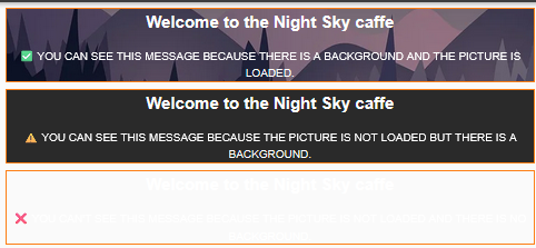
First Block
<section class="hero">This block has:
- a dark background color
- a background image
- white text
Result
the text is clearly visible.
Second Block
<section class="hero no-image">This block has:
- no background image
- but still has a dark background color
- white text
Result
the text is still visible, because the dark background color remains.
Third Block
<section class="hero no-image no-bg">This block has:
- no background image
- no dark background color
- white text remains
Result
the text becomes very hard or impossible to see on the light page background.
Visual Explanation
Block 1:
image + dark background + white text
-> visible

Block 2:
no image + dark background + white text
-> visible

Block 3:
no image + no dark background + white text
-> not visible on light page background
11. Main Lesson from the Example
Always try to set a background color together with a background image.
Why?
Because if the image fails to load:
- the section still has a visible background
- the text can remain readable
- the design does not break completely
This is one of the most practical rules when working with background images.
12. Useful Background Properties in This Example
background-color
Sets the background color of the element.
Example
background-color: #2a2a2a;background-image
Sets the background image.
Example
background-image: url(...);background-position
Controls where the image is placed inside the element.
Example
background-position: center;Meaning
the image is centered inside the element.
Extra Example
background-position: top left;
background-position: right center;
Meaning
top left-> image starts from the top-left cornerright center-> image is placed on the right and centered vertically
13. Simple Practical Example
.hero {
  background-color: #2a2a2a;
  background-image: url(hero.jpg);
  color: white;
}
Meaning
- dark fallback background
- hero image on top
- white text remains readable
Another Example
.banner {
  background-color: #004466;
  background-image: url(banner.jpg);
  background-position: center;
  color: white;
}
Meaning
- dark blue fallback background
- centered banner image
- white text on top
14. Short Comparison
Content Images
- carry meaning
- belong to the real content
- usually added with
<img> - should have
alttext
Decorative Images
- used for design only
- do not carry useful information
- often added with CSS backgrounds
15. Mini Cheat Sheet
<img>              -> content image
background-image   -> decorative image
background-color   -> fallback if image does not load
16. Very Short Practical Rule
If you use a background image,
also set a background color.
17. Common Mistakes
Mistake 1
Using a background image without a fallback background color.
Problem
if the image does not load, text may become unreadable.
Mistake 2
Using CSS background images for important content images.
Problem
background images are decorative and are not the correct choice for content that must be understood by the user.
Mistake 3
Forgetting that background does not cover margin.
Problem
the outside spacing remains transparent.
Mistake 4
Using white text without checking contrast.
Problem
if there is no dark image or dark background color, white text may disappear visually.
18. Final Summary
The background-image property is used to add a background image to an element.
Important things to remember:
- background images are usually decorative
- they are usually added in CSS
- backgrounds cover content and padding, not margin
- background color should often be added together with the image
- if the image fails to load, the background color can still protect readability
Super Short Memory Line
background-image = picture for the background
background-color = safety fallback
<img> = meaningful content image
19. background-repeat Property
The background-repeat property controls whether a background image repeats.
By default, a background image repeats:
- horizontally on the X axis
- vertically on the Y axis
This usually happens when the background image is smaller than the element.
So if the element is large and the image is small, the browser may copy the image many times to fill the space.
20. Main Idea
A background image does not always appear only once.
If there is extra empty space inside the element, the browser may tile the image again and again.
That behavior is controlled by background-repeat.
In Simple Words
background-repeat decides if the background image should be copied many times or shown only once.
21. Syntax
background-repeat: repeat | repeat-x | repeat-y | no-repeat;The most common values are:
repeatrepeat-xrepeat-yno-repeat
22. Values of background-repeat
22.1 repeat
background-repeat: repeat;This repeats the image:
- horizontally
- vertically
So the image repeats on both axes.
This is the default value.
Visual Idea
[icon][icon][icon][icon]
[icon][icon][icon][icon]
[icon][icon][icon][icon]
Meaning
the browser fills the whole area with repeated copies of the image.
22.2 repeat-x
background-repeat: repeat-x;This repeats the image only on the X axis.
So the image repeats only horizontally.
Visual Idea
[icon][icon][icon][icon]

(no repeating downward)
Meaning
the image creates one horizontal row.
22.3 repeat-y
background-repeat: repeat-y;This repeats the image only on the Y axis.
So the image repeats only vertically.
Visual Idea
[icon]
[icon]
[icon]
[icon]
Meaning
the image creates one vertical column.
22.4 no-repeat
background-repeat: no-repeat;This does not repeat the image.
The image appears only once.
Visual Idea
[icon]

(no more copies)
Meaning
one image only, no tiling.
23. Example Structure
HTML
<div class="container">
  <div class="tile-set">
    <div class="tile repeat"></div>
    <div class="tile repeat-x"></div>
    <div class="tile repeat-y"></div>
    <div class="tile no-repeat"></div>
  </div>
</div>
CSS
*,
*::before,
*::after {
  box-sizing: border-box;
}

body {
  margin: 0;
  font-family: sans-serif;
  line-height: 1.5;
  color: #2a2a2a;
}

.container {
  max-width: 960px;
  padding-left: 8px;
  padding-right: 8px;
  margin-left: auto;
  margin-right: auto;
}

.tile-set {
  display: flex;
  flex-wrap: wrap;
  justify-content: center;
  padding-top: 40px;
  gap: 30px;
}

.tile {
  position: relative;
  height: 120px;
  flex-basis: calc(100% / 2 - 40px);
  border: 2px dashed #2a2a2a;
  border-radius: 4px;
  background-color: #fff;
  background-image: url("https://cdn0.iconfinder.com/data/icons/essentials-volume-6/128/apple-512.png");
  background-size: 40px;
}

.tile::before {
  position: absolute;
  top: -32px;
  width: 100%;
  content: "";
  font-weight: 700;
  font-size: 20px;
  text-align: center;
}

.no-repeat {
  background-repeat: no-repeat;
}

.no-repeat::before {
  content: "no-repeat";
  font-family: monospace;
}

.repeat-x {
  background-repeat: repeat-x;
}

.repeat-x::before {
  content: "repeat-x";
}

.repeat-y {
  background-repeat: repeat-y;
}

.repeat-y::before {
  content: "repeat-y";
}

.repeat {
  background-repeat: repeat;
}

.repeat::before {
  content: "repeat";
}24. What Happens in This Example
Each .tile:
- has the same background image
- has the same size
- but uses a different
background-repeatvalue
So each block shows a different repeating behavior.
The four results are:
- one block repeats the image in both directions
- one block repeats only horizontally
- one block repeats only vertically
- one block shows the image only once
This example is useful because it clearly compares all main values.
25. Detailed Explanation of Each Result
25.1 Block with repeat
.repeat {
  background-repeat: repeat;
}
What Happens
- the image repeats left to right
- the image repeats top to bottom
- the whole block is filled with copies
Use Case
good for patterns or textures.
Example
body {
  background-image: url(pattern.png);
  background-repeat: repeat;
}
Meaning
a small pattern fills the whole page background.
25.2 Block with repeat-x
.repeat-x {
  background-repeat: repeat-x;
}
What Happens
- the image repeats from left to right
- it does not repeat downward
Use Case
useful for horizontal decorative lines, stripes, or borders.
Example
.header {
  background-image: url(line.png);
  background-repeat: repeat-x;
}
Meaning
the decorative line repeats across the width of the header.
25.3 Block with repeat-y
.repeat-y {
  background-repeat: repeat-y;
}
What Happens
- the image repeats from top to bottom
- it does not repeat sideways
Use Case
useful for vertical side decorations.
Example
.sidebar {
  background-image: url(side-pattern.png);
  background-repeat: repeat-y;
}
Meaning
the pattern repeats down the sidebar.
25.4 Block with no-repeat
.no-repeat {
  background-repeat: no-repeat;
}
What Happens
- the image appears only once
- no extra copies are created
Use Case
best for large decorative images like hero sections, banners, and cards.
Example
.card {
  background-image: url(star.png);
  background-repeat: no-repeat;
}
Meaning
one decorative star appears once only.
26. Practical Rule
Even if you think the image is already larger than the element, it is still good practice to write:
background-repeat: no-repeat;Why?
Because it prevents unexpected repeating behavior if:
- the element becomes larger
- the image changes
- the layout changes later
So this rule makes the design safer and more predictable.
27. Example with a Hero Section
.hero {
  background-color: #2a2a2a;
  background-image: url(path-to-image);
  background-repeat: no-repeat;
}
This means:
- the section has a background color
- it has a background image
- the image will not repeat
This is very common in real websites.
28. Full Hero Example
HTML
<section class="hero">
  <h2 class="title">Welcome to the Night Sky caffe</h2>
  <p class="text">
    Lorem ipsum dolor sit amet consectetur, adipisicing elit. Dolore asperiores,
    vel porro reiciendis consequatur a facilis incidunt molestias unde voluptatem.
    Dolorum accusantium consectetur voluptas dolores ipsam ipsa temporibus rerum voluptate.
  </p>
</section>
CSS
* {
  box-sizing: border-box;
}

body {
  margin: 0;
  font-family: sans-serif;
  line-height: 1.5;
  color: #2a2a2a;
  background-color: #fafafa;
}

.hero {
  min-height: 200px;
  padding: 40px;
  display: flex;
  flex-direction: column;
  justify-content: center;
  background-color: #2a2a2a;
  background-image: url(https://cdn.pixabay.com/photo/2020/07/06/01/33/forest-5375005_1280.jpg);
  background-repeat: no-repeat;
  color: #fff;
  text-align: center;
  background-position: center;
}

.title {
  margin-top: 0;
}

.text {
  margin: 0;
}
Welcome to the Night Sky caffe
Lorem ipsum dolor sit amet consectetur, adipisicing elit. Dolore asperiores, vel porro reiciendis consequatur a facilis incidunt molestias unde voluptatem. Dolorum accusantium consectetur voluptas dolores ipsam ipsa temporibus rerum voluptate.
29. What Happens in the Hero Example
The .hero section:
- gets a dark background color
- gets a background image
- does not repeat the image
- centers the image
- shows white text on top
So the result is:
- one clean background image
- no tiled copies
- readable text in the middle
30. Why no-repeat Is Useful Here
Without no-repeat, the browser could repeat the image if:
- the element becomes larger
- the image is smaller than the area
- the layout changes on another screen size
That can look messy, especially in hero sections.
With:
background-repeat: no-repeat;the image stays single and clean.
This is why no-repeat is very often used in:
- hero sections
- banners
- large cards
- section backgrounds
31. Related Property: background-position
In the example, we also use:
background-position: center;This means the background image is centered inside the element.
So together:
background-repeat: no-repeat;
background-position: center;
means:
- show the image once
- place it in the center
This is a very common combination.
Another Example
.hero {
  background-image: url(hero.jpg);
  background-repeat: no-repeat;
  background-position: top center;
}
Meaning
- one image only
- no tiling
- placed at the top center
32. Short Summary of All Values
repeat
- repeat on X and Y
repeat-x
- repeat only horizontally
repeat-y
- repeat only vertically
no-repeat
- do not repeat
33. Mini Cheat Sheet
repeat     -> repeat on X and Y
repeat-x   -> repeat only horizontally
repeat-y   -> repeat only vertically
no-repeat  -> do not repeat
34. Very Short Practical Rule
For hero sections and large decorative backgrounds,
use background-repeat: no-repeat;
35. Simple Example
.hero {
  background-image: url(hero.jpg);
  background-repeat: no-repeat;
  background-position: center;
}
Meaning
- one image only
- no tiling
- centered in the element
Another Simple Example
.pattern {
  background-image: url(dot.png);
  background-repeat: repeat;
}
Meaning
- a small pattern is repeated to fill the whole area
36. Common Mistakes
Mistake 1
Forgetting that background images repeat by default.
Problem
the image may tile unexpectedly.
Mistake 2
Using repeat for a hero image.
Problem
large section backgrounds can look broken or messy.
Mistake 3
Not combining no-repeat with background-position.
Problem
the image may appear only once, but in an awkward corner.
Mistake 4
Using a tiny image without realizing it will repeat many times.
Problem
the result may look like a pattern, even if that was not the plan.
37. Final Summary of background-repeat
The background-repeat property controls whether a background image is repeated.
It is especially important when:
- the image is smaller than the element
- you want a tiled pattern
- or you want to prevent repeating completely
In real projects:
repeatis useful for patterns and texturesrepeat-xis useful for horizontal decorationrepeat-yis useful for vertical decorationno-repeatis very common for hero sections, banners, and large decorative backgrounds
Super Short Memory Line
repeat = tile, repeat-x = horizontal, repeat-y = vertical, no-repeat = one image only38. background-position Property
The background-position property controls the position of a background image inside an element.
It tells the browser where the background image should appear relative to the element's box.
It uses two coordinates:
xfor the horizontal positionyfor the vertical position
39. Syntax
background-position: x y;This means:
- the first value controls left-right position
- the second value controls top-bottom position
40. What Values Can Be Used
You can use:
- absolute units like
px - relative units like
% - keywords like
top,bottom,left,right, andcenter
So background-position is flexible.
You can use exact values or easy keywords.
41. Default Value
By default:
x = lefty = top
So the background image starts from the top-left corner of the element.
Default Meaning
background-position: left top;This is the same as:
background-position: 0 0;So if you do not write background-position, the browser places the image in the top-left corner automatically.
42. Main Idea
A background image does not always appear where we want by default.
Sometimes we want it:
- in the center
- at the top
- at the bottom right
- or moved by an exact number of pixels
That is exactly what background-position is for.
It helps control which part of the image is visible and where the image is placed inside the element.
43. Example with Keywords
43.1 Center the Image
background-position: center;This usually means:
background-position: center center;So the image is centered:
- horizontally
- vertically
43.2 Top Right Corner
background-position: right top;The image moves to the top-right corner of the element.
43.3 Bottom Left Corner
background-position: left bottom;The image moves to the bottom-left corner.
43.4 Bottom Right Corner
background-position: right bottom;The image moves to the bottom-right corner.
44. Example with Pixels
background-position: 20px 30px;This means:
- move the image
20pxfrom the left - move it
30pxfrom the top
This is useful when you need exact positioning.
Another Example
background-position: 100px 0;Meaning:
- move the image 100px from the left
- keep it at the top
45. Example with Percentages
background-position: 50% 50%;This places the image in the center.
Because:
50%horizontally = center50%vertically = center
Another Example
background-position: 100% 0;Meaning:
- place the image at the far right
- keep it at the top
Another Example
background-position: 0 100%;Meaning:
- place the image at the left
- move it to the bottom
46. Visual Idea
Imagine the element as a box.
top-left      top-center      top-right
left-center   center          right-center
bottom-left   bottom-center   bottom-right
background-position decides where inside that box the background image is placed.
In simple words: it chooses the image's starting point inside the element.
47. Common Examples
47.1 Default Position
background-position: left top;Diagram
[image..............]
[...................]
[...................]
The image starts in the top-left corner.
47.2 Centered Image
background-position: center;Diagram
[...................]
[......image........]
[...................]
The image is centered.
47.3 Bottom Right
background-position: right bottom;Diagram
[...................]
[...................]
[............image..]
The image is placed in the bottom-right corner.
48. Practical Example
.hero {
  background-image: url(hero.jpg);
  background-repeat: no-repeat;
  background-position: center;
}
What this means:
- use
hero.jpgas the background image - do not repeat it
- place it in the center of the element
This is very common for:
- hero sections
- banners
- large decorative blocks
49. Why background-position Matters
Without background-position, the image starts at the top-left corner.
Sometimes that is fine, but often it is not the best visual result.
For example:
- a person's face may be cut off
- the most important part of the image may not be visible
- the composition may look unbalanced
So developers use background-position to control which part of the image gets attention.
This is especially useful when:
- the image is decorative
- the block has fixed dimensions
- the image is larger than the visible area
50. background-position with no-repeat
background-position is very often used together with:
background-repeat: no-repeat;Why?
Because if the image appears only once, its position becomes very important.
A very common pair is:
background-repeat: no-repeat;
background-position: center;
Meaning:
- show one image only
- place it in the center
This usually gives a clean, balanced result.
51. More Practical Examples
Example 1
.card {
  background-image: url(icon.png);
  background-repeat: no-repeat;
  background-position: right top;
}
Meaning:
- show one icon
- place it in the top-right corner of the card
Example 2
.footer {
  background-image: url(pattern.png);
  background-repeat: no-repeat;
  background-position: left bottom;
}
Meaning:
- show the decorative image once
- place it in the bottom-left corner
Example 3
.banner {
  background-image: url(photo.jpg);
  background-repeat: no-repeat;
  background-position: center;
}
Meaning:
- one image
- no repeating
- centered inside the banner
52. Short Summary
background-position controls where the background image appears inside the element.
It uses:
- horizontal position
- vertical position
You can set it with:
- keywords
- pixels
- percentages
53. Mini Cheat Sheet
left top       -> top-left corner
center         -> center center
right top      -> top-right corner
left bottom    -> bottom-left corner
right bottom   -> bottom-right corner
50% 50%        -> center
20px 30px      -> exact offset
54. Very Short Practical Rule
For hero sections, use:
background-repeat: no-repeat;
background-position: center;
This usually gives a clean and balanced result.
55. Common Mistakes
Mistake 1
Forgetting the default position.
Problem
If you do not set background-position, the image starts at left top.
Mistake 2
Using no-repeat but not setting the position.
Problem
Then the image may appear in an awkward corner.
Mistake 3
Using only one keyword without understanding it.
Example
background-position: center;Problem
This means center horizontally and center vertically.
Mistake 4
Using pixel values without checking responsiveness.
Problem
An exact pixel position may look good on one screen size and worse on another.
56. Final Summary of background-position
The background-position property is used to place a background image inside an element.
Important things to remember:
- it works with two coordinates:
xandy - default is
left top - you can use keywords, pixels, or percentages
- it is often used together with
background-repeat: no-repeat
Super Short Memory Line
background-position = where the background image appears inside the element57. Positioning with Offsets
To avoid depending on the element's size and setting the background position rigidly, you can use the offset positioning syntax.
background-position: x offset-x y offset-yFor example, if you need to place the background in the bottom-right corner of an element of any size, so that the background is 30px away from the right edge and 20px away from the bottom edge:
background-position: right 30px bottom 20px;In our welcome section, the following background image is used, but it is taller and wider than the element.
In the example, we see its upper part, because by default it is positioned relative to the top-left corner.
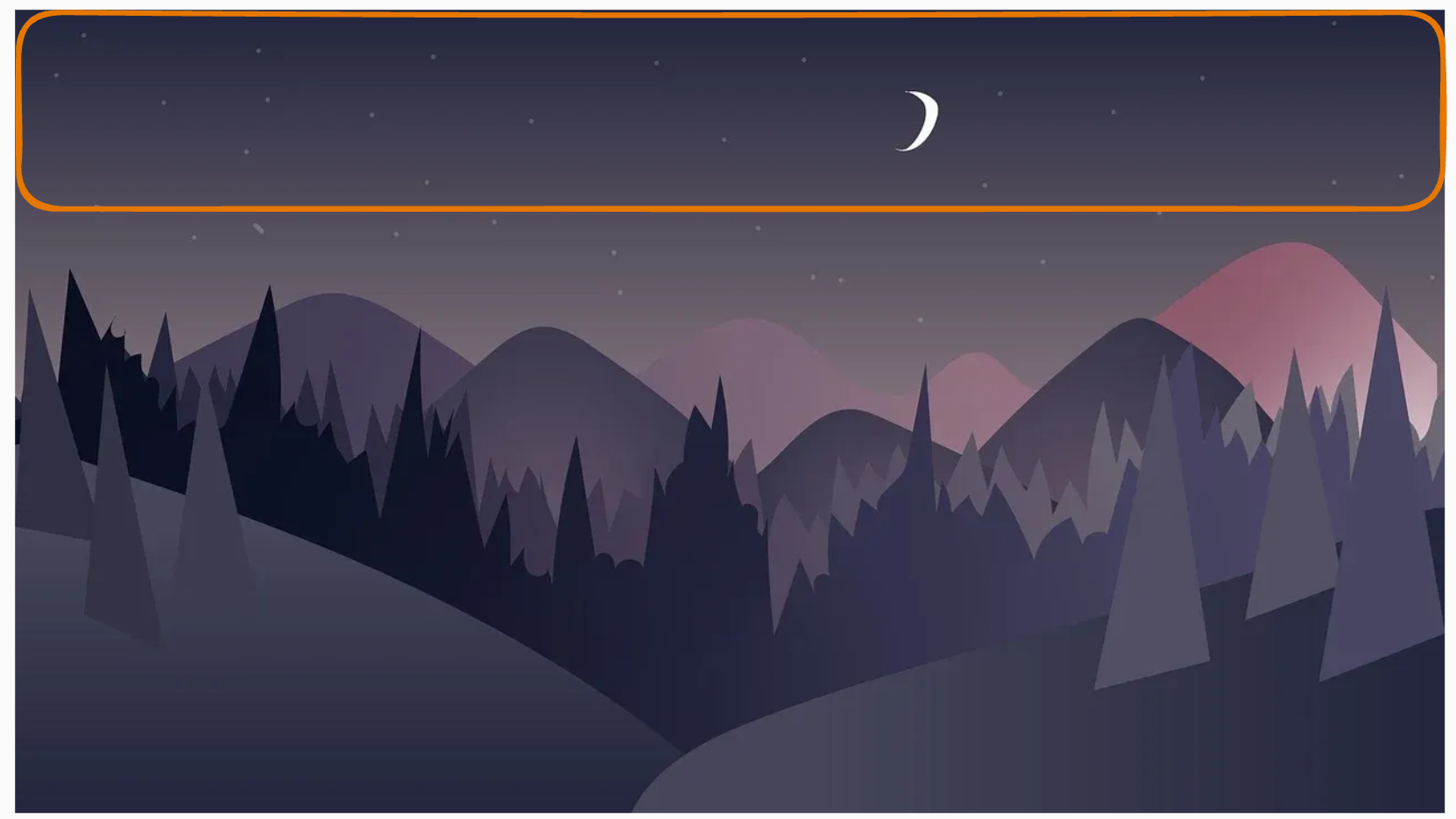
If we want to show the center of the image instead, we can use:
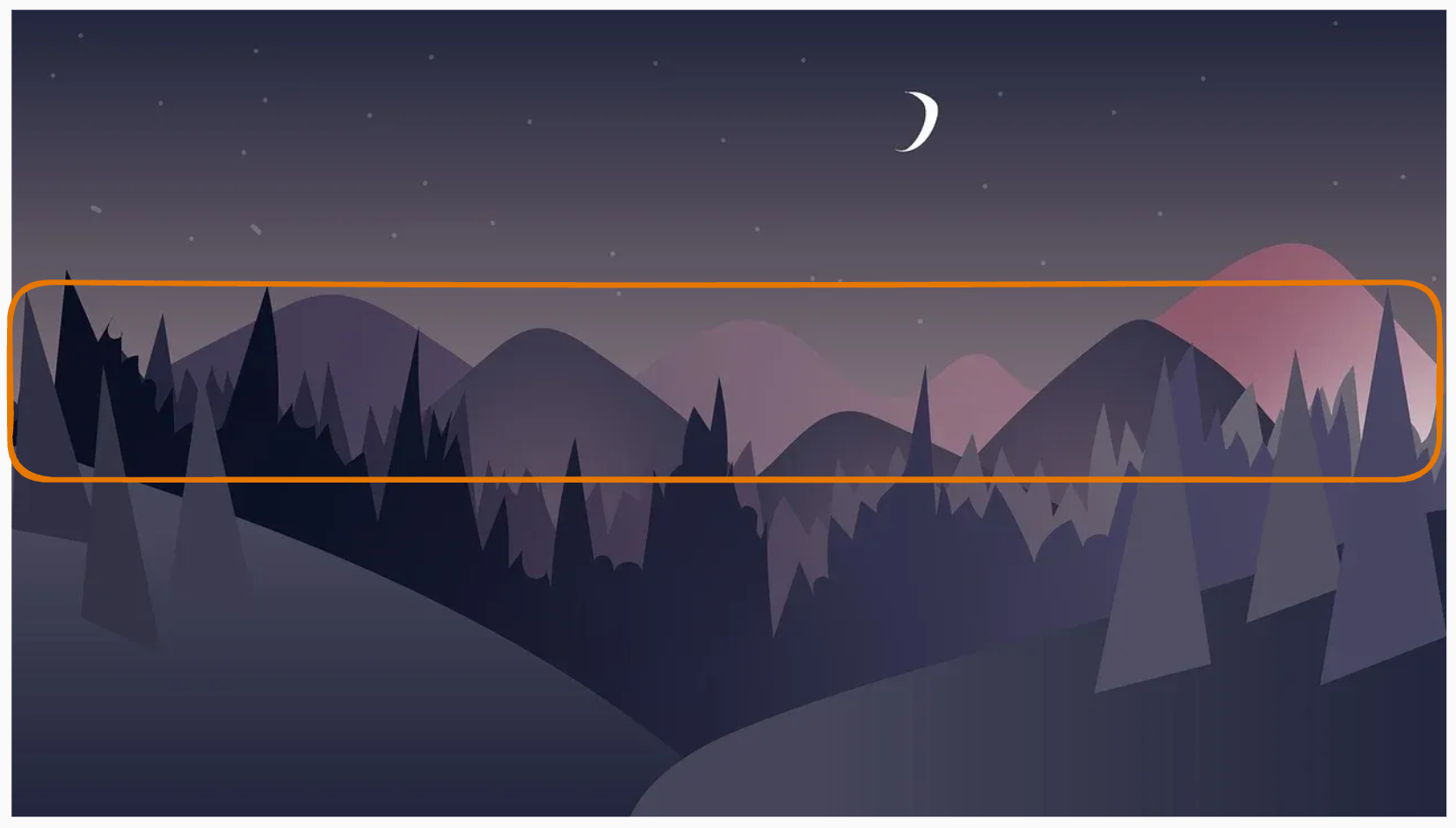
Welcome to the Night Sky Cafe
Lorem ipsum dolor sit amet consectetur, adipisicing elit. Dolore asperiores, vel porro reiciendis consequatur a facilis incidunt molestias unde voluptatem. Dolorum accusantium consectetur voluptas dolores ipsam ipsa temporibus rerum voluptate.
Welcome to the Night Sky Cafe
Lorem ipsum dolor sit amet consectetur, adipisicing elit. Dolore asperiores, vel porro reiciendis consequatur a facilis incidunt molestias unde voluptatem. Dolorum accusantium consectetur voluptas dolores ipsam ipsa temporibus rerum voluptate.
The first section shows the default position (top-left), while the second section shows the image centered. You can see the code that we used for this image here.
HTML
<section class="hero">
  <h2 class="title">Welcome to the Night Sky Cafe</h2>
  <p class="text">
    Lorem ipsum dolor sit amet consectetur, adipisicing elit. Dolore asperiores,
    vel porro reiciendis consequatur a facilis incidunt molestias unde voluptatem.
    Dolorum accusantium consectetur voluptas dolores ipsam ipsa temporibus rerum voluptate.
  </p>
</section>

<section class="hero center">
  <h2 class="title">Welcome to the Night Sky Cafe</h2>
  <p class="text">
    Lorem ipsum dolor sit amet consectetur, adipisicing elit. Dolore asperiores,
    vel porro reiciendis consequatur a facilis incidunt molestias unde voluptatem.
    Dolorum accusantium consectetur voluptas dolores ipsam ipsa temporibus rerum voluptate.
  </p>
</section>
CSS
* {
  box-sizing: border-box;
}

body {
  margin: 0;
  font-family: sans-serif;
  line-height: 1.5;
  color: #2a2a2a;
  background-color: #fafafa;
}

.hero {
  min-height: 250px;
  padding: 40px;
  display: flex;
  flex-direction: column;
  justify-content: center;
  background-color: #2a2a2a;
  background-image: url(https://cdn.pixabay.com/photo/2020/07/06/01/33/forest-5375005_1280.jpg);
  background-repeat: no-repeat;
  color: #fff;
  text-align: center;
}

.hero.center {
  background-position: center;
}

.title {
  margin-top: 0;
}

.text {
  margin: 0;
}

.hero + .hero {
  margin-top: 10px;
}
58. background-size Property
By default, the browser does not resize a background image.
If the image is larger or smaller than the element, there will either be empty space not covered by the background, or, on the contrary, only part of the background will be visible.
background-size: auto | value | cover | contain;59. Main Idea
This property lets you adjust the image size by setting the required width and height.
If the height is not specified, it will be calculated automatically while preserving the proportions.
60. Basic Examples
Original Image Dimensions
background-size: auto auto;Width 200px, Height Will Be Proportional
background-size: 200px;Width 200px, Height 300px
background-size: 200px 300px;61. Reserved Values: cover and contain
The values can also be two reserved words: cover and contain.
The purpose of both values is to fit the background image into the container as much as possible, but in different ways.
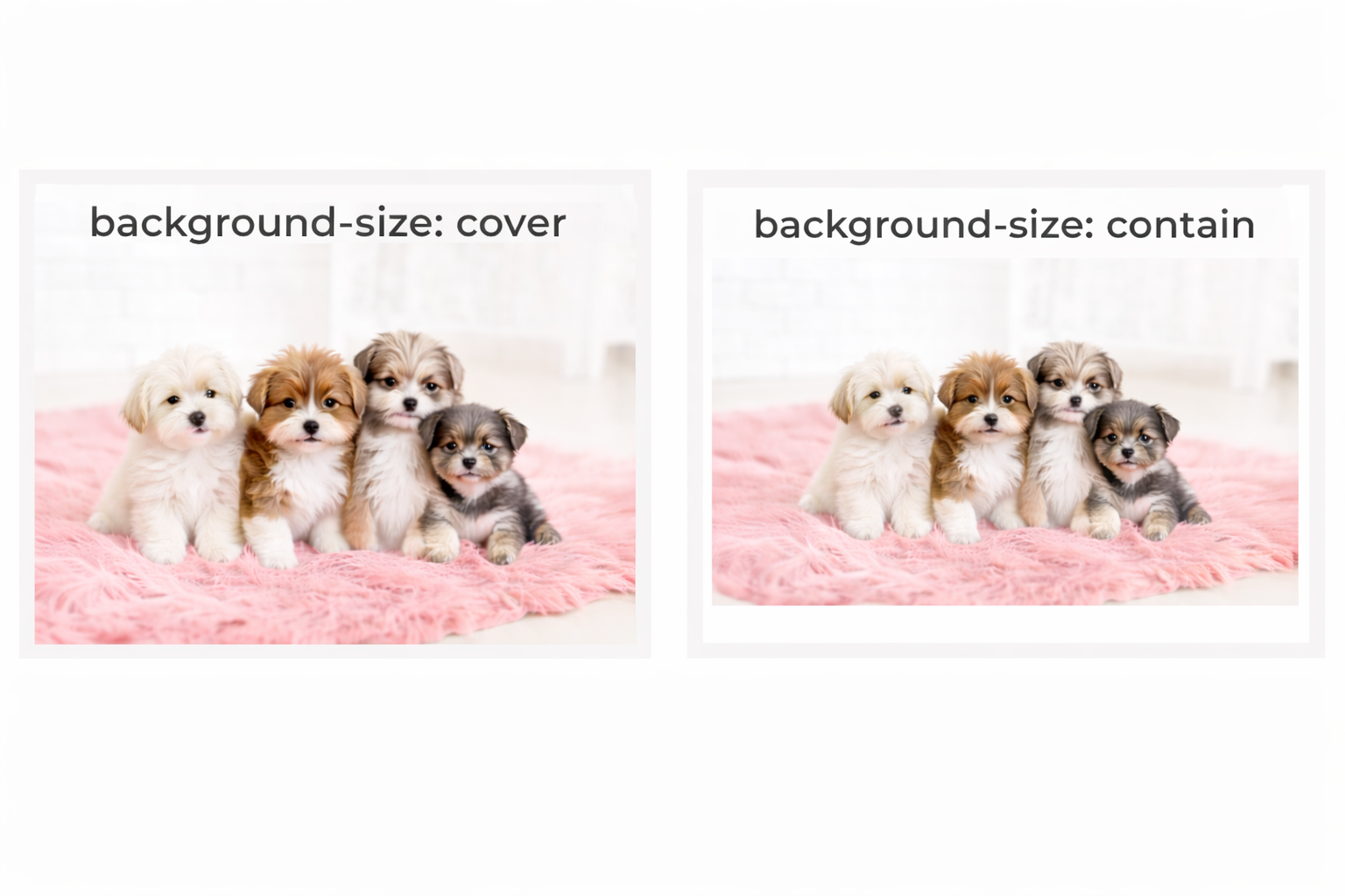
cover-> by cropping the excess partscontain-> by leaving empty space inside the container
62. The cover Value
The cover value:
- always preserves the image proportions
- gives the image the minimum dimensions needed to completely fill the background of the element
- may crop part of the image vertically or horizontally if the proportions of the image and the element are different
Example
background-size: cover;63. The contain Value
The contain value:
- always preserves the image proportions
- gives the image the largest possible dimensions at which it still fits completely inside the element
- may leave empty space vertically or horizontally if the proportions of the block and the image do not match
Example
background-size: contain;64. Short Comparison
cover
- fills the whole element
- keeps proportions
- can crop the image
contain
- shows the whole image
- keeps proportions
- can leave empty space
65. Very Short Summary
background-size = controls the size of the background image
cover           = fill the block, crop excess
contain         = show full image, may leave empty space
66. Multiple Background Layers
You can assign several background images to an element at the same time.
To do this, list them in the background-image property separated by commas.
For each image, you can also set values for other background properties, also separated by commas in each property.
background-image: url(path to image 1), url(path to image 2);
background-size: 100px, cover;
background-position: top right, center;
background-repeat: repeat-x, no-repeat;
Example of Multiple Backgrounds
Here is the code for the above demo:
body {
  margin: 0;
}

.canvas {
  max-width: 1000px;
  height: 400px;
  background-image: url("https://cdn-icons-png.flaticon.com/512/361/361678.png"),
    url("https://cdn-icons-png.flaticon.com/512/4206/4206277.png"),
    url("https://cdn-icons-png.flaticon.com/512/814/814513.png"),
    url("https://stickerswiki.ams3.cdn.digitaloceanspaces.com/Pig_Valera/223715.512.webp"),
    url("https://cdn.pixabay.com/photo/2017/08/30/01/05/milky-way-2695569_1280.jpg");
  background-size: 80px, 100px, 150px, 130px, cover;
  background-repeat: no-repeat;
  background-position: top 120px right 130px, top 270px left 130px, center, 100px 60px, center;
}
67. Tip
In most cases, a multilayer background can be replaced with a single image in which all the other images were combined beforehand in a special editor.
The size of such a file will be smaller than the total size of separate images, and the browser will only need to make one request instead of five, which will also increase the loading and rendering speed of the page.
68. Linear Gradient
A gradient is a transition from one color to another.
In CSS, a gradient is treated as a background image, so it is usually set with the background-image property.
A linear gradient is created with two or more colors and a chosen direction.
69. Syntax
background-image: linear-gradient(
  <direction>,
  <color-1>,
  <color-2>,
  <color-3>,
  ...
);
70. Important Idea
A linear gradient does not use a real image file.
It is generated by CSS.
Because it is a background image, it works the same way as other backgrounds.
71. Color Formats
The color values in a gradient can use any valid CSS color format:
- keywords
rgb()rgba()hex
You can also mix them.
72. Example
background-image: linear-gradient(to right, red, #00ff00, rgba(0, 0, 255, 0.5));This means:
- start with red
- then move into green
- then into semi-transparent blue
73. Gradient Direction
The gradient direction can be set with keywords such as:
to topto rightto bottomto left
You can also combine them:
to top leftto top rightto bottom leftto bottom right
74. Default Direction
If no direction is given, the default is:
to bottomSo the gradient goes from top to bottom.
Example
background-image: linear-gradient(red, blue);This is the same as:
background-image: linear-gradient(to bottom, red, blue);75. Combined Directions
If you write:
background-image: linear-gradient(to top left, red, blue);the gradient moves toward the top-left corner.
That means the starting point is effectively on the opposite side, near the bottom-right area.
76. Direction with Degrees
You can also set the gradient direction using an angle in degrees with the deg unit.
Example
background-image: linear-gradient(45deg, red, blue);77. Important Rule
0degis equivalent to:
to topAs the angle increases, the gradient line rotates clockwise.
78. What Is the Gradient Line?
The gradient line is an imaginary straight line that goes through the center of the element.
The colors are distributed along that line.
The visible color bands are always perpendicular to the gradient line.
Simple Idea
gradient line = direction of color change
color bands   = lines across that direction
79. Basic Examples
79.1 Top to Bottom
background-image: linear-gradient(to bottom, red, blue);Meaning
- red at the top
- blue at the bottom
79.2 Left to Right
background-image: linear-gradient(to right, red, blue);Meaning
- red on the left
- blue on the right
79.3 Diagonal
background-image: linear-gradient(to top right, red, blue);Meaning
- the gradient moves diagonally toward the top-right
79.4 Angle
background-image: linear-gradient(90deg, red, blue);Meaning
- the gradient is rotated by 90 degrees from
0deg
80. Double Background Technique
Since a gradient is a background image, it can be combined with another background image in layers.
This is often used to place a semi-transparent color layer over a photo.
That technique is very common for:
- hero sections
- banners
- cards with text over images
Example
background-image:
  linear-gradient(
    to bottom,
    rgba(255, 0, 0, 0.3),
    rgba(255, 0, 0, 0.3)
  ),
  url(path-to-image);
81. How This Works
There are two background layers here.
First Layer
The top layer is a linear gradient with transparency:
linear-gradient(
  to bottom,
  rgba(255, 0, 0, 0.3),
  rgba(255, 0, 0, 0.3)
)
Notice that the start color and end color are the same.
So visually, this creates not a visible color transition, but a uniform transparent overlay.
It is still written as a gradient because it is used as a background layer.
Second Layer
The second layer is the actual image:
url(path-to-image)This image is placed below the gradient layer.
82. Why Use This Technique?
It helps when you want:
- a darker or colored photo background
- better text readability
- a more cinematic or branded look
For example, if white text is placed over a bright image, it may be hard to read.
A semi-transparent overlay solves that problem.
83. Visual Idea
Without overlay:
[photo background]
[text may be hard to read]
With overlay:
[semi-transparent color layer]
[photo background below]
[text becomes easier to read]
84. Example Explanation
background-image:
  linear-gradient(
    to bottom,
    rgba(255, 0, 0, 0.3),
    rgba(255, 0, 0, 0.3)
  ),
  url(path-to-image);
This Means
- first, add a red transparent layer on top
- then place the image below it
- the red overlay has 30% opacity
- the text on top of the image becomes easier to see
85. Practical Example
What This Does
<div style="width: 200px; height: 200px; background: linear-gradient(to right, red, yellow, black);">
  Gradient
</div>
86. Short Summary
A linear gradient:
- is a background image
- is created with two or more colors
- has a direction
- can be used alone or layered over an image
87. Mini Cheat Sheet
linear-gradient(red, blue)
-> default direction: top to bottom

linear-gradient(to right, red, blue)
-> left to right

linear-gradient(45deg, red, blue)
-> angled gradient

linear-gradient(rgba(...), rgba(...)), url(...)
-> transparent overlay + image
88. Very Short Practical Rule
Use a linear gradient overlay on top of an image
when text needs better contrast.
89. Final Summary
linear-gradient() is used to create a smooth transition between colors in CSS.
Important things to remember:
- it is used as a
background-image - direction can be set with keywords or degrees
- default direction is
to bottom - gradients can be layered with images
- transparent gradients are often used as overlays for better text readability
The background Property
The background property is a shorthand property used to set the values of all the background properties at the same time.
Syntax
background: background-color background-image background-repeat background-position background-attachment background-sizeIf a component is not specified, its default value is used.
Examples
/* Sets only the background color */
background: #2a2a2a;

/* Transparent background color with an image repeating along the x-axis, starting from the top-left corner. */
background: url(path to image) repeat-x;
It is recommended, at least at first, to use separate properties for each value, because the shorthand background property can be easy to get confused with.
⬅ Back